Showing posts with label Project : What I See. Show all posts

Tuesday, 6 March 2012

Final Production


"What I See"

The completion of What I See was well-received from fellow classmates. The textured backgrounds inspired other students, and a few will be compiling a texture-database as an extra credit this summer for the McMaster media students to come. Overall, I feel the piece is beautiful but wish to re-do the silhouettes in charcoal so that the characters will better match the textured backgrounds, and so the silhouettes will be uniform (I would appreciate if the same style of silhouette was used throughout the piece).
What I see was accepted into McMaster's FRESH event. FRESH is a peer-review event which mostly consists of thesis projects. It was an honour to be selected to present in FRESH as I'm a year 2 student performing year 3 work. 


This animation was created by combining scanned textures to Flash silhouettes. If you wish to know more about the piece then please click here.


Rational


"WHAT I SEE"
Advanced Animation 3H03
RATIONAL
Written by Nicole Wilk

Our video follows a Chinese high school student, Suki Bai, as we wished to explore the experience and relationship of an individual who has newly made Canada their home. In order to incorporate her experience as more universal we utilized silhouettes with many wide-angle and establishing shots. Still, her young voice and hesitant English draws the viewer to her experiences and her opinions.

As Suki is exploring the clashes and blending of two cultures, we explored combining craft and vector art to tell her story. We felt aesthetically that Flash backgrounds would be flat and unappealing and that the program should be used primarily for animating the identical silhouettes frame-by-frame, and After Effects to be used for effects. The raster images were compiled in Photoshop and consisted of scanned papers and textures used to pull the viewer into a world that is factual to Suki, but fantastical to many Canadians. With this in mind we chose vivid but unrealistic colours to brighten her perspective.

We wished to incorporate an upbeat but repetitive (not distracting) soundtrack for the background audio, but also one that could be incorporated with the separate animation sequences at the beginning and end of the interview, one that could tie everything together. The opening sequence hints at the video to come and creatively provides a place to introduce the art and title prior to the interview, and the ending sequence incorporates a new twist on a previous scene. 

Formally we explored the immigration experience in Canada as observed by Suki Bai; aesthetically we combined mediums (non-digital to digital, raster and vector, colours and black & white, 2-D and flat); and technically we utilized a wide range of equipment and programs such as Canon Rebel ti, scanner, T4N Handheld recorder, Photoshop, Flash, Premiere, and After Effects.     

Empty

Sorry! Nothing here yet!

Empty

No content posted. Sorry about that.

The Background Process with Nicole Wilk


AND THEN


AND THEN


The Animation Process with Nicole Wilk


Creating The World


The world spinning was a tricky concept and one that would involve a lot of effort.

How To Make The World
  1. Buy a sphere surface (my case a styrofoam ball)
  2. Hand-paint the ball
  3. Use something to stick into it (a toothpick)
  4. Set up a camera on a tripod 
  5. Rotate very slowly the world until you've circled around
The background:

I used a black piece of cloth and clustered tiny silver (sparkle) beads over the surface.


world.mov


After collecting the materials and waiting for the pain to dry I cut another styrofoam ball in half so that the sphere doesn't shift while shooting. I also do not have a clicker (a remote control that will tell your camera to shoot without pushing the shoot button.). Clickers prevent movement of the camera from the pushing of the button action, and also reduces handling the camera.


The Set-up


The result

Frames

Take 2

Take 3

Take 4
The Frames


The result was that the globe clashed with the animation style of the video. So I had to convert the globe into our animation style. 

To do this with the ocean:

  1. take the stop motion shots of the globe with a camera
  2. open the shots in a single photoshop document and align them together 
  3. take the artistic material you wish to convert the shape into, and back that a background
  4. using the marquis tool cut out on the same y-axis the circles, and shift the circle over by an increment of your choosing (but the same increment each time) on the x-axis. 
  5. re-align your cut out spheres


To do this with the land:
  1. using tghe same stop-motion images that are aligned in your photoshop document, you will create new layers with masks. The masks will contain a trace of the earth that you've performed with the marquis tool.
  2. On my version I shifted the earth over by an increment as I did with the ocean. You may prefere to not have the eath shift, but to keep it still.
  3. I then applied some layering effects that mostly create light and shadows on my 2-D texture.


Cutting up the oceans


The Process of cutting out the ocean

A closer look

The earth - hand traced each frame
Earth Frames
Finished Frames (png)


Scene1WorldTurns


The Animation Process with Ying Shan

Animator


Ying had expressed that he wished to learn how to use Flash, and this desire along with Lisa's willingness to teach is why we selected Flash as our animation software. Although willing to teach, Lisa would explain how to accomplish a task and then leave to do her work at home. This lead to a fair bit of complications as she wasn't around during the process when questions arose. To make up for Ying's inability to complete the Flash animation as quick as she can Lisa took on more scenes.

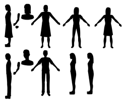
As Ying didn't have the silhouettes to reference and Lisa's silhouettes were different in every scene she drew, we sat down as a team and Lisa finalized the silhouettes. This was something I had been pushing for a couple weeks and was glad it happened. Ying used the silhouette templates to create the spinning world silhouettes, but had issues understanding how the scene was suppose to play out. He thought Suki stayed on one position of the world, and then the world had to fully rotate three times. The issue with this is that the amount of screen time Suki has is dramatically reduced. and the sheer number of other silhouettes have no purpose.

To explain the scene fuller I drew a demonstration in Paint and sent them to Ying.


Paint Explanation


Ying's first Flash animation was to draw and animate the buildings. His second, to do the world. Third, to do the ending graduation scene, and fourth to animate the confusion in the classroom.


The buildings were successful, although he had issues with the world scene. Lisa agreed to quickly re-animate it so the characters could enter the frame according to the charts above. She also replaced Ying's ending animation which incorporated a car and a house that grew from the ground. This was because the scene had clip-art in it (I believe the graduation hat and briefcase), she didn't ask for permission before re-doing his scene (which was mend-able and the concept worked). I thought his ending scene had more impact than what Lisa had decided: flash animated fireworks.

To make up for his lack of working contribution to the animation Ying put his all into animating the clustered words in After Effects. He asked for clarification as to what needed to be animated as the words we used were not in his vocabulary yet. And then asked others what they thought throughout his progress. He used a 3-D effect that had the layers separated to highlight the confusion of the words. 


The Animation Process with Lisa


Lead Animator


Lisa's Experience

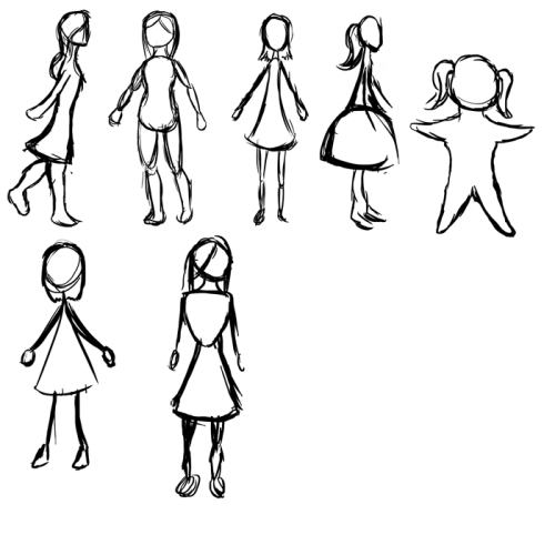
These sketches are character designs for our Character Portrait assignment.  We decided to use basic silhouettes to portray our characters.  At first I tried making realistic silhouettes, but we decided to take advantage of the fact that we’re working in animation and make more stylized, cartoon-y characters.  I tried a lot of different shapes to get her design down - the 4th one is based on a flower, for example.  My personal favourites are number 1, 3, and and 6.  Ultimately we decided to use number 3, but with a slightly longer dress and longer hair.  

I found the male form harder to draw.  I always find males harder to draw, and stylizing them just makes it worse.  We’re going to go with something close to number 3. 


A motion study of the main character for our Character Portrait assignment.  I animated her in Flash.  The animation is smooth, but I think I to adjust her stride a bit so her steps aren’t as long.  She seems to be strutting her stuff here, which isn’t exactly the look I was going for.


The Process


Character Design & Colour Swatches


As we are working in silhouettes Lisa was charged with creating the form of both a male and female lead that reflects the characters cultural background: Chinese. As well as the color palette. The original backgrounds were going to be tea-stained, with accenting colours matching that ofthe Chinese and Canadian flags. Hence red and white, and red and gold. The colours below were taken direct from country flags. 


Colour Swatch by Lisa Galbraith


 First Character Design

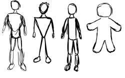
Lisa's first take on the silhouettes was to draw them realistically. This may have been a reflection on The Lost Kiss video that I produced earlier in the year which inspired the group's desire to use silhouettes. However, as an animation project it did not seem appropriate to try to reenact a human's movement and mannerisms (The Lost Kiss was filmed with a green screen), nor did a realistic representation that was not the actual silhouette of our interviewee seem appropriate. Instead, to reflect the uplifting tone of the interview Lisa was asked to create the silhouette in a more universal representation of a girl and a guy that reflected Asian lineage.   

First Character Design by Lisa Galbraith


Second Character Design

The second character designs reflected the universal female image mainly due to the use of skirts. The first sketch was hard to understand the overall appearnce due to the side angle. The second lacked a skirt. The fourth sketch was excluded due to the Victorian nature, and the fifth due to the childish nature and body-shape of the starfish. The seventh still reflected too close to realism.

We decided that the 3rd and 6th sketches were the closest images that matched the animation concept we wished to reflect from the interview.  


Second Character Design by Lisa Galbraith (female)

The third character sketch here is the closest match to the 3rd and 6th character sketches of the main female character above.
Second Character Design by Lisa Galbraith (male)


The Motion Test


We were still designing the character when the motion test was due so Lisa had to decide to draw a temporary figure for the motion test or finalize the character first. She chose to use a temporary female image and then not alter the character design.


The motion test went well, and had a decent amount of frames. Lisa did not continue to use that amount of frames for the final animation.


Re-Designing the Main Character

There were two instances that led me to push Lisa to complete the character design even after she had started animating without the go-ahead. One was when an Asian friend watched the animated clips and thought the silhouette represented myself - a tall, skinny white girl - then didn't believe me when I said she was Asian.  The other was a comment during our roughcut review that suggested the silhouettes could be more defined. I agreed with both these points: that the silhouette should feel Asain (or at least be an anonymous silhouette), and that the detail in the shape of our character was lacking. 


To help Lisa grasp these concepts I sent her the following links:

To help identify that she is Asian I thought a fairly common old-ish Asian hair-style would work: 


Asian Hair


To assist her understanding of how abstracted silhouettes can be detailed without being realistic I sent her this clip, suggesting to watch around 2:50 to demonstrate how each line identifies the shape, with a caution that the skeletal style they are using here is not what we are after. We want a female that is short and Asian.  


Invention of Love (2010) - Animated Short Film


Roughdraft

After the animatic's completion the group began their project.  


FIRST ROUGH

The issue with Flash is that it is version sensitive. The one available in the presentation room, the mac lab, and on lisa's laptop are all different and that corrupts aspects within the file. Originally we exported the file from Flash to load into FinalCut or Premiere for the audio but the .mov file was corrupted because we used the lab to do this instead of Lisa's laptop when the files had been created on her laptop. Unfortunately, she was not willing to stay with us to export and left as soon as she thought she was able.  Using Flash to add the audio was no better although this is what Lisa suggested we do, and though the file itself was fine, exporting it created both visual and audio glitches. 

Our first roughcut was barely an experience with doubled up audio and glitching visuals that left traces of images on the screen. 


SECOND ROUGH


The second rough cut was much better. Nothing had been timed yet as everyone had their own pieces that they worked on. My Backgrounds had been completed and sent over the internet, and Roshanth had sent Lisa the length times of the animation clips as he was in charge of audio, this included assembling the pace of the piece by the audio interview recording. 


The Animatic & Storyboard


The Animatic was conceptualized, drawn, and assembled in a day. 

The group was given a week to plan their project and have a visualization to show the class. They unanimously decided to create a silhouette animation after witnessing Nicole's final project The Lost Kiss, from her Introduction to Video class a semester earlier. From this point Flash was selected as the animation software following Lisa Galbraith's suggestion and Ying Shan's desire to learn the program. Ying then completed the interview with Suki Bai, and Nicole incorporated the interview data into a storyboard that was scanned and then assembled in Premiere. Roshanth timed the clips to the audio track and within a week the group had an assembled Concept to present complete with audio and basic visuals.  


"What I See" An Animatic
Drawn, scanned & assembled by Nicole Wilk.
Timed by Roshanth Nadesapillai.
Recorded by Ying Shan. 
Voice if Suki Bai.


The storyboard incorporates the interview that Ying Shan obtained for us within a few days of cementing our idea, but Lisa delayed in the character design so I created the storyboards fairly roughly. After review, scene that needed changing was the food on page 5. To incorporate more motion into the piece we created a restaurant scene that incorporates a famous Chinese food chain that serves Duck.


The Storyboard by Nicole Wilk


The Interview Process

This project incorporates an animated interview. My group wishes to look at the multicultural aspect of Canada by interviewing a recent immigrant and finding out her thoughts about living in Canada.


Interview
Interviewer: Ying Shan       Interviewee: Di Bai

Why did you come to Canada?
I came to Canada because my parents wants me to get a better education.

Do you think Canadian people are kind and easy to make friends with?
It's is easier to get along with Canadian people because Canada is a
multicultural country. People came from many different countries and
they are friendly and happy to help people.

How does living in Canada differ from living in China?
In Canada, there are many houses and condos. But in china there are
more apartments and houses which are for rich people mostly.

What challenges do you face in Canada?
I think language is the most hardest problem for me. Sometimes I don't
even understand what our teachers and classmates say in the classroom.

Contrast teachers at High School between China and Canada…
Teachers in community schools are very nice and they are always
patient with students and homework are much less than Chinese school.

Contrast school life between China and Canada…
There are only four classes every-day. and school ends at 3.30 which
is more earlier than Chinese school.

What do you find most interesting about Canada?
The most interesting thing about Canada is Multi-culture. I can make
many friends who came from different countries and understand many
different cultures from them.

What is your favourite part of China that cannot be found in Canada?
My favourite part of china is the food. I really miss my Chinese food
which I can't eat in here.

What is your favourite part of Canada?
The best thing for me in Canada is fresh air and Canada has very nice
environment to make me feel so much better than china.

What is your plan for the future?
For my future planning, I'm in second year and I will go to the
university and after I graduate from university I will find a Job in
Canada. Hopefully I will enjoy my Canadian life later on.

Thank You!

Character Portrait


3-minute digital flash animation comparing China and Canadian idiosyncrasies

Inspiration

Our Character Portrait is inspired by artists Lotte Reiniger and Kara Walker who specialise in silhouettes. The animation technique that our group will explore is in some ways an extension of their work, and in others a springboard for new ideas and techniques. In planning this project, we feel a deeper exploration of their process will be helpful in accomplishing this character portrait.

About Lotte Reiniger & Her Process

Lotte Reiniger

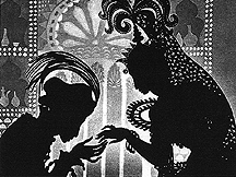
Lotte Reiniger's artistic medium was established at a young age. As a youth, she created silhouettes to perform Shakespeare in her shadow theater. In 1917, while creating silhouettes of actors and actresses at Max Reinhardt's school of acting, she made a connection with film-maker  Paul Wegener. He hired her to create silhouettes for the titles of some of his films, and eventually helped her discover the secret of animating her silhouettes. From then on she created some short silhouette films.
We found her process of animation inspiring as it is much like today's animation process. While not created on the computer, each piece of her animated work has several important parts, such as the creation of characters, movement  of those characters, characters  settings, and sound effects (including speech and musical compositions). Secondly, we are motivated by how each scene is created using a storyboard, with every detail drawn in full color. The figures and scenes are later reduced to silhouettes for animation. Taking away the lines and colors of each drawing, however, did not destroy the charm of Reinger’s characters.  She also believed that the lack of color in the black silhouettes allowed the viewers imagination more room to expand and interact with the story. This idea is very inspiring to us because our story involves the audience to interact with the story and put themselves into the main characters shoes. We are hoping to achieve this goal by using non-coloured silhouettes despite dealing with a concept of nationality and race. 

The Adventures of Prince Achmed by Lotte Reigner

References:

About Kara Walker & Her Process

Kara Walker employs silhouettes to tell stories much like Lotte Reiniger. Based on a study of the popular art form from the 18th century Walker began experimenting using silhouette as a story-telling medium. She chose the basic black outlines of character as it simplifies the persona being represented and because her technique is based on 18th century backlighting portraitures. In Walker's eyes, a silhouette is a substitution for a true likeness of a person.  She explores the medium in many different forms, from larger paper silhouettes, to installations of cast shadows, and to the animation of silhouette marionettes. 

Kara Walker: My compliment, my enemy, my oppressor, my love

We hope to follow her character design style but with a digital twist. Her characters have exaggerated features which makes them cartoonish, and in doing so she adds some humour to the dense subject matter of race, gender and sexuality that she explores. It is important to mention that most of her animations involves around the theme of "history". She is able to portray history in her own unique way that makes it interesting again. She is both trying to entertain and inform her audiences which is what we want to do with our projects. It is very impressive how she shows us the past in an interesting way through the use of cut-paper silhouettes. We hope to achieve that same feel with our character design. Walker’s work holds interest because no matter how many times the work is seen, there always seems to be something new that had been unnoticed. 


Choosing A Story & Interview Biography
Following Lotto Reiniger’s exploration of silhouettes we decided to animate our story. However, much like Kara Walker's silhouette compositions in choosing a re-tellable story, we decided upon a story that could relate to and communicate a current world issue brought on by globalization: the living lifestyle of different countries as experienced by a youth of today.

Flag & landmass of China
We will explore the subtle differences on how lifestyle and values are experienced between the native Chinese and Canadian cultures. Our idea is born from a question brought up during a group discussion that we thought interesting with endless possibilities: Why do so many Chinese immigrate to Canada, while China is growing fast? In order to explore this concept, we interviewed Di Bai. 


Di Bai is a Chinese girl who came to Canada around one and half years ago. Her family immigrated to Toronto in August of 2010. She is a grade 11 student at Earl Haig high school, which is a famous public school founded in Toronto. Before she came to Canada, she lived in Da Lian, a beautiful city north of China. Since she spent her first half of high school life in Da Lian and the other half of high school life in Toronto she will have a lot of specific personal experiences and challenges, which she may share with us. She is our link to compare and contrast the life of international students between China and Canada. We will animate her interview using silhouette animation.

Flag & landmass of Canada

We designed our interview questions to be interesting to the viewer by exploring stereotypes, challenges and comparative questions between the two countries. The difference between China and Canada are more elusive and include differences in lifestyle and mindset that might not stand out immediately when one thinks about their first forays onto Canadian soil; though these differences stand out over time. These will be further illustrated by our interviewee which then will be used to form our script. Our final animation will explore these subtle differences between living in China and living in Canada as experienced by the personal story of Da Lian.

Designing The Story
Understanding Di Bai’s story is first step towards animating our project. With this information we will create imagery to fit the story by simplifying and abstracting the backgrounds using paper art; we hope this will offset and compliment the solid colour of silhouettes. We find that it will be easier to tell the story in animated silhouette because the viewer doesn't get lost in the little details of the character's clothes and features, but is forced to see the character as a whole. We believe keeping a character in silhouette allows a deeper connection with the story and the audience. Instead of a character with a specific trait to identify with, the character is ambiguous enough  for the audience to relate to universally. 

A paper scan by Nicole Wilk

We will break the story into scenes depicting Di Bai’s thoughts concerning the interview questions. These visualised thoughts will be illustrated movements and actions related to the matter at hand, these thoughts will be both literal and abstract and will not follow reality directly, especially during scene transitions.
Creating Characters & Backgrounds
Understanding the weight of shape in silhouettes our character has been through many designs. Our goal in creating Di Bai as a silhouette is to make her vague while representing her nationality, and in that we made her stature small (short and thin), and took care to make her appear fashionable and tidy. This is vague enough to follow Asian stereotype as well as reflect the actual appearance of Di Bai. 


The silhouette animation will take place within Flash, which uses Vector drawings.  Within the application frames are drawn and then altered individually utilizing toolbox and frame-by-frame editing. Our main character (and her family) will be represented as a white silhouette to differentiate her from the crowd (representing by the common silhouette colour of black). We will use Flash to animate movement and will rely on it for flat backgrounds that are also silhouetted.

The backgrounds will be an environment for the characters to inhabit and interact with. This may be difficult as they will be raster-based from scanning, photography and photoshop editing. The backgrounds will be abstract and creative while not being distracting. We understand that careful background design is important in order to establish the mood of the story.  Our main concept is to create simple and entertaining animation to amuse and engage the viewers. Our interest in relation to stop frame animation is the use of the silhouette.

Sound Composition
The animation will consist of voice- over narration of Di Bai herself from the interview. Sound effects will assist scene placement as well as transitions. Sound effects will be gathered from  from freesound.org which is covered by the creative commons license.